
The question
The FAO, the United Nations agency that leads the fight against hunger, wanted a first picture of world food security from its own data. The brief came as a list of questions: how many people are undernourished, how many people the food available could theoretically feed, how that food is used, which countries suffer most, and where food aid goes.
Behind the list sits one question: is hunger a problem of production, or of distribution?
- 535Mpeople undernourished in 2017, at the very least
- 8.8bnpeople the calories available could feed
- 36%of the world’s cereals go to animal feed
- 83%of Thailand’s cassava is exported
Four FAO files
| File | Content | Period | Countries |
|---|---|---|---|
| Population | Population per country, in thousands | 2013–2018 | 236 |
| Food balance sheets | For each country and product: calories, proteins and fats per person, production, trade and uses | 2017 | 174 |
| Food aid | Tonnes of aid received, by product | 2013–2016 | 76 |
| Undernourishment | Undernourished people, in millions, as three-year averages | 2012–2014 to 2017–2019 | 203 |
The preparation was mostly about making four files speak the same language. I converted every quantity to the same units, turned text values such as <0.1 into numbers, and used the 2016–2018 average for the year 2017.
The world produces enough food
In 2017, 535.7 million people were undernourished, 7.1% of the world population, or one person in 14.
To estimate how many people the world’s food could feed, I multiplied each country’s daily calories per person by its population and by 365, then divided the world total by an average need of 2,400 kcal per day, taken from an FAO source. The calories available in 2017 could feed about 8.8 billion people, 1.3 billion more than the world population. Plant products alone could feed 96% of it.
Where the food goes
Of the 9.8 billion tonnes of food available in countries, only half is eaten directly by people.
- Food49.5%
- Processing22.4%
- Animal feed13.2%
- Other uses8.8%
- Losses4.6%
- Seed1.6%
Losses look small in percentage, but they amount to 454 million tonnes of food.
Cereals tell the same story more sharply: people eat 43% of them directly, and 36% go to animal feed. More than a third of the world’s cereals are used to produce meat, eggs and dairy.
An unequal table
The averages hide a wide gap between countries. In 29 of the 174 countries, the food available is below the daily need.
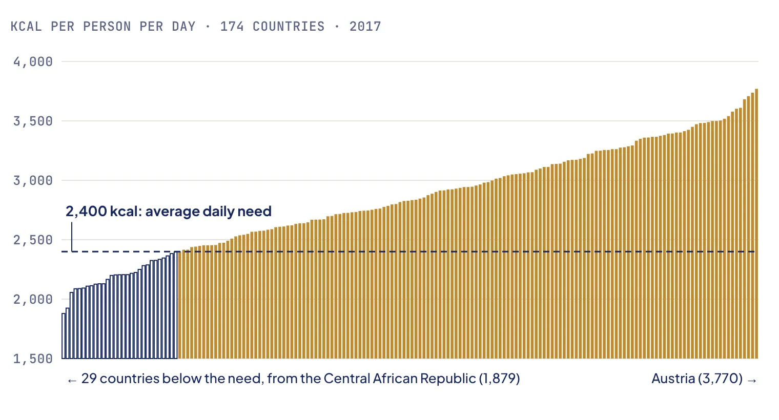
Each bar is a country. Hollow bars fall below the average daily need of 2,400 kcal.
The ten best-supplied countries, six of them in Europe, have 3,625 kcal per person per day on average, 1,225 more than the need. The ten least-supplied, seven of them in Africa, have 2,060, a deficit of 340. In theory, the surplus of one person in the first group could close the gap of three to four people in the second.
Where undernourishment is measured, it reaches almost half the population in the hardest-hit countries.
- Haiti48.3%
- North Korea47.2%
- Madagascar41.1%
- Liberia38.3%
- Lesotho38.2%
- Chad38.0%
- Rwanda35.1%
- Mozambique32.8%
- Timor-Leste32.2%
- Afghanistan28.9%
Thailand shows how food can leave a country with hunger. In 2017, about 9% of Thais were undernourished, yet Thailand exported 25.2 million tonnes of cassava, 83% of what it grew. The data cannot say whether those exports reduced what Thais eat, but it shows a crop grown mainly for export.
Where food aid goes
Between 2013 and 2016, Syria, Ethiopia and Yemen received the most food aid, ahead of South Sudan, Sudan and Kenya. Seven of the ten largest recipients are in Africa, the other three in Asia, and many of them were facing war or a major crisis. Aid followed acute crises: it fell sharply for Ethiopia, Sudan and South Sudan in 2015, while Yemen’s rose again as its war escalated.
What a second look revealed
When I came back to this project for my portfolio, I checked what the data covers before trusting what it says. Three findings changed how the results should be read.
Units and joins. The food balance sheets are in thousands of tonnes: once multiplied by 1,000, they are in tonnes, not kilograms. My first version understated food losses and Thailand’s cassava exports by a factor of 1,000. Three countries also had different names from one file to another (the United Kingdom, Czechia and Eswatini), so the joins dropped them without warning. With the names harmonised, the number of people the world could feed rises from 8.7 to 8.8 billion.
# Harmonise country names before any join, then check nothing is left unmatched
dispo_alimentaire['Zone'] = dispo_alimentaire['Zone'].replace({
    'Royaume-Uni': "Royaume-Uni de Grande-Bretagne et d'Irlande du Nord",
    'Tchéquie (la)': 'Tchéquie',
})
aide_alimentaire['Pays bénéficiaire'] = aide_alimentaire['Pays bénéficiaire'].replace({'Swaziland': 'Eswatini'})
print(sorted(set(dispo_alimentaire['Zone']) - set(population['Zone'])))   # → []
The undernourished total is a floor. Countries with no estimate were counted as zero. That is reasonable for France or Germany, but the 96 countries without any estimate are home to more than 3.3 billion people, 44% of the world, and they include some of the hungriest places on earth: the Democratic Republic of the Congo, Yemen, Somalia, South Sudan, Syria, Zambia and Zimbabwe. The top 10 above only ranks countries that have an estimate.
Food aid is not as disconnected from needs, nor as collapsed, as it first looked. My original conclusion was that none of the countries with the highest undernourishment rates were among the top aid recipients. But six of the ten largest recipients have no undernourishment estimate at all, so they could never appear in the other ranking. Among the 49 recipients that do have one, aid clearly follows the number of undernourished people (Spearman ρ = 0.55, p < 0.001), but not their share (ρ = 0.28, not significant at the 5% level). Aid goes to large numbers of hungry people and to crises, rather than to the highest rates.
The headline drop in world food aid, −82% between 2013 and 2016, was also mostly an artefact of coverage.
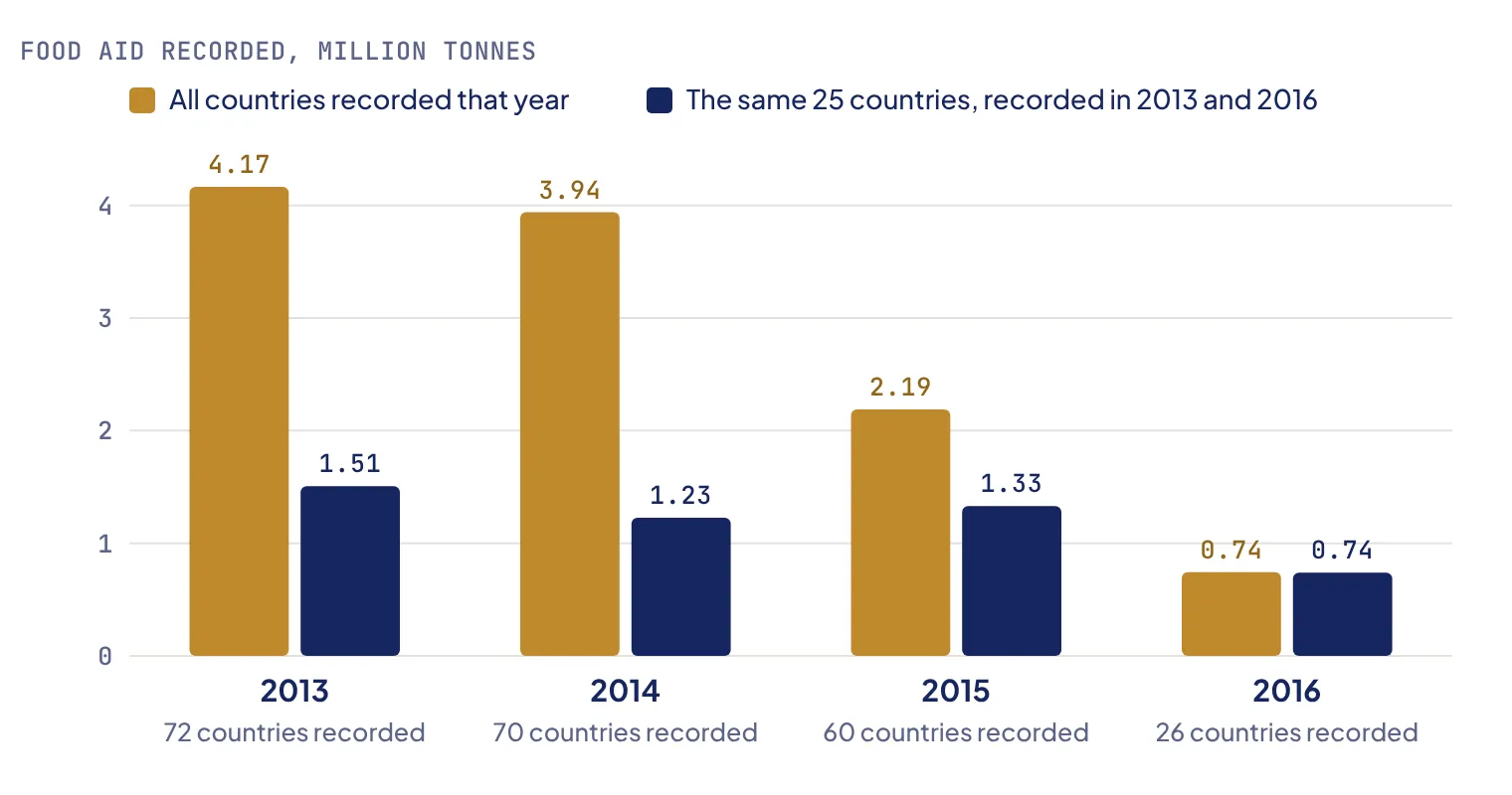
72 countries have aid recorded in 2013, only 26 in 2016. On the same 25 countries, aid fell by half: a real decline, but not a collapse.
What I would do next
- Use the full FAOSTAT series, to follow the same countries over time instead of comparing a single year.
- Complete the aid data with the World Food Programme’s figures, to tell a real drop in aid from a country that simply stopped reporting.
- Weight the theoretical calculation by real needs, which vary with age, sex and activity, rather than a single 2,400 kcal average.
Limits
- Undernourishment estimates are missing for 44% of the world population, so every total and ranking based on them is incomplete.
- Food availability is not consumption: the calories available include what is wasted at home and in shops.
- The theoretical calculation leaves aside transport, storage, prices and politics, which are precisely what decides who eats.
What I learned
[In your own voice, two or three sentences: for example, what checking the units and the joins taught you, why the countries that are missing from a dataset can matter as much as the ones in it, or how a second look changed your conclusions on food aid.]