The most useful feedback I got on my last project was about something I’d never considered: my colours.
Three dashboard pages, weeks of work, an analysis I was proud of. Then the panel told me my visuals weren’t accessible.
It stings for about an hour. Then you look into it and realise you missed something basic.
What I learned
- A pretty palette isn’t a readable one. My five shades of pink varied in hue but barely in brightness. Elegant on screen, unreadable for someone colourblind or on a badly calibrated projector.
- A gradient has to mean something. My bar charts faded from dark to light across the bars, and that gradient encoded absolutely nothing. The bar length already carried the value. All the colour did was suggest a second variable that didn’t exist. If a gradient doesn’t add information, it adds confusion. One flat colour was the better answer.
- The test that changes everything: convert your charts to greyscale. If you can’t tell the categories apart in black and white, neither can everyone else. Free, instant, brutal.
- Colour should never carry information alone. Direct labels, position, legend: always give a second channel.
- Text contrast below 4.5:1 fails WCAG AA. That standard exists for a reason.
What I changed
So I rebuilt every palette around even steps in brightness rather than variations in hue, and stripped the decorative gradients out entirely.
Accessibility isn’t an aesthetic constraint. It decides whether your work is readable by everyone, or only by people who see the way you do.
Before and after
The before and after are below. The difference is more obvious than I expected.
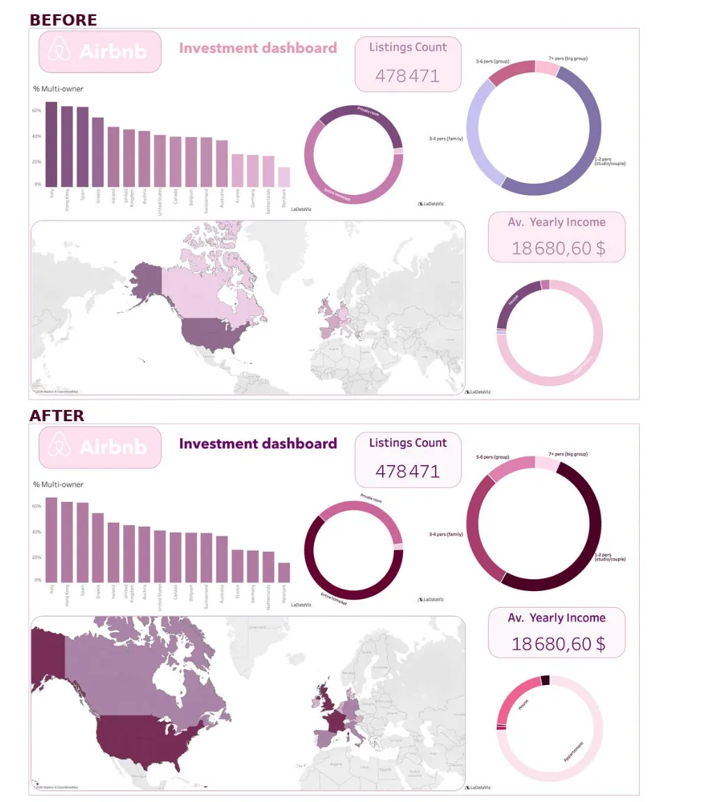
The bar chart loses its meaningless gradient for one flat colour, and the ring charts and the map move to shades that run from very dark to very light.
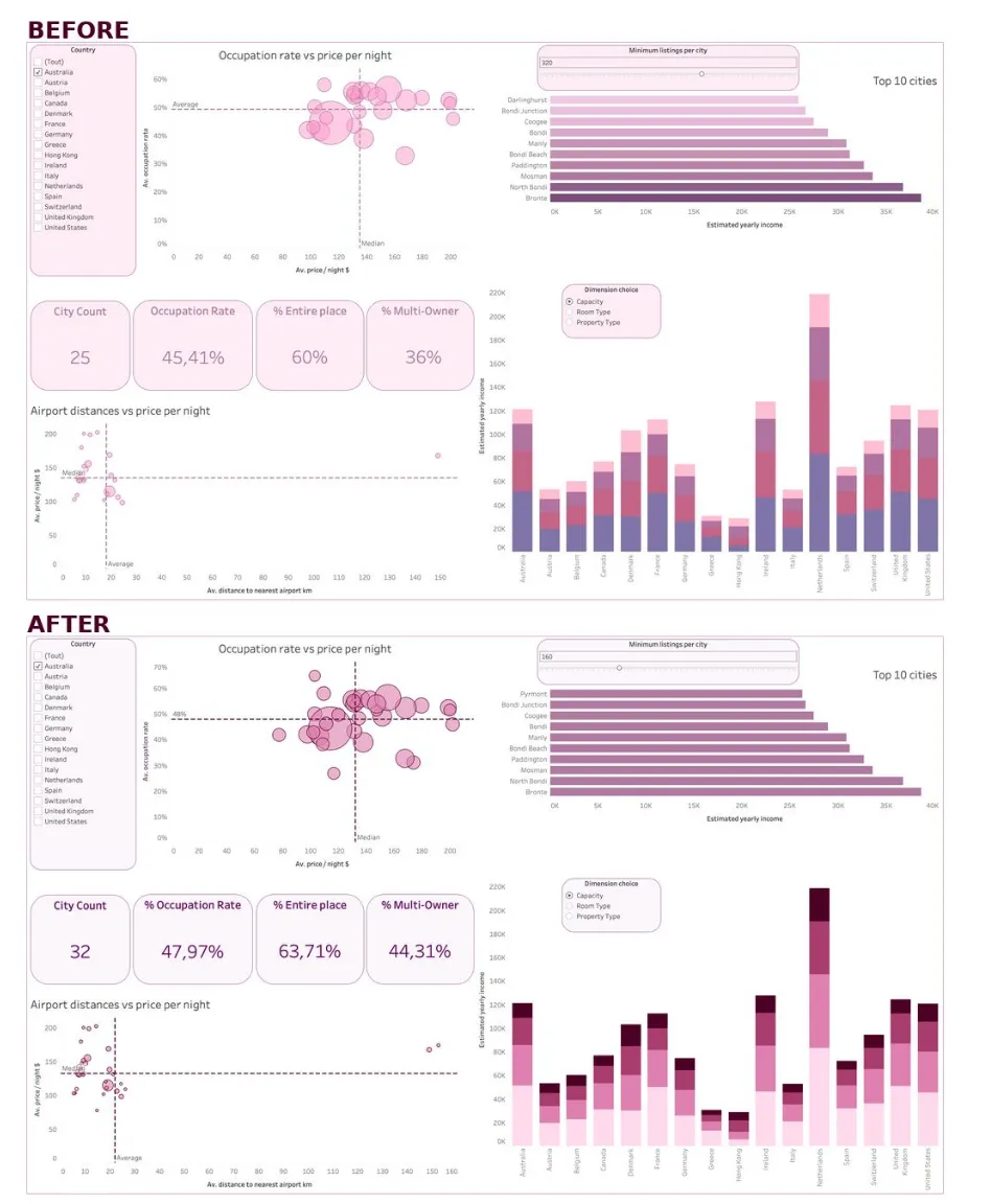
The slider is not set at the same value in the two captures, so the figures differ: only the colours are being compared here.
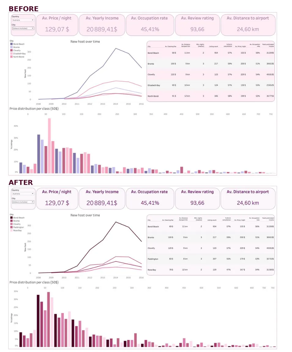
The five cities now run from a very dark plum to a very light pink, instead of five colours of similar brightness.
The full dashboard and the analysis behind it are in the Airbnb case study.