
The question
Picture someone with enough money to buy a property and rent it out on Airbnb, with no geographic constraint: they could buy in Lisbon, Melbourne or Berlin. The question is easy to ask and hard to answer: in which city should they buy?
In practice, it breaks down into three questions asked in order. How much can I charge per night? How many nights a year will I fill? And together, does that make a worthwhile income? Price, occupancy and estimated yearly income are the backbone of the dashboard, and they appear at every level.
But income alone is not enough to decide. An investor also needs to know who they are competing with (private hosts or professionals), what actually rents (entire homes or private rooms), and what eats into the margin once inside the market: cleaning fees, minimum stays, strict cancellation policies. These are the criteria that separate two cities showing the same income.
- 478klistings after cleaning, 2008 to 2017
- 16countries
- 986cities with enough listings to compare
- 3dashboard pages, from world to neighbourhood
One principle runs through the whole dashboard: no number is ever read on its own. A city charging $130 a night means nothing until you know whether that is above or below its market. Every indicator is compared to a reference, the median city on the charts and the national average on the KPI cards. You never read a value, you read a gap.
Try it yourself
The dashboard is published on Tableau Public. Launch it below to move the slider, filter a country or compare cities, exactly as an investor would.
Filters, slider and tabs all work. Best viewed on a computer.
Making 500,000 listings comparable
The data comes from Inside Airbnb, which collects the public pages of Airbnb listings city by city. The raw file held nearly 500,000 listings and 89 variables.
The longest part of the cleaning was the city names. The field was free text, typed by the hosts themselves, so the same city appeared in several spellings, with or without accents, and in different languages and alphabets: Hong Kong alone came under 26 labels. Rather than an automatic normalisation, which could silently merge different cities, I harmonised them country by country with explicit correspondence dictionaries, so that every decision stays visible in the notebook.
I then enriched the data with two external sources:
- World Bank exchange rates for 2017, to convert every price into US dollars. Without it, no comparison between countries is possible.
- OurAirports, to compute each listing’s distance to the nearest major international airport, using a BallTree that measures real distances on the surface of the globe.
# Nearest large international airport for every listing (great-circle distance)
tree = BallTree(
    np.radians(df_airport[["latitude_deg", "longitude_deg"]].values), metric="haversine"
)
dist, idx = tree.query(np.radians(df[["Latitude", "Longitude"]].values), k=1)
df["distance_aeroport_km"] = (dist[:, 0] * 6371).round(2)   # radians → km
Four decisions that shape every number
| Decision | Why |
|---|---|
| Country + city as the key, never the city alone | Otherwise Venice in Italy and Venice in California merge into one point in the middle of the Atlantic |
| Dormant listings filtered in Tableau, not deleted in Python | 20% of listings had zero availability and very few reviews. They are excluded from profitability, but still counted in the size of the market |
| A minimum number of listings per city, set with a slider | An average income calculated on eight listings is unstable. The slider makes the trade-off between coverage and robustness visible |
| Host growth stopped at the end of 2016 | The data ends in June 2017, so keeping that year would have drawn a drop in activity that never happened |
Page 1: the global market at a glance
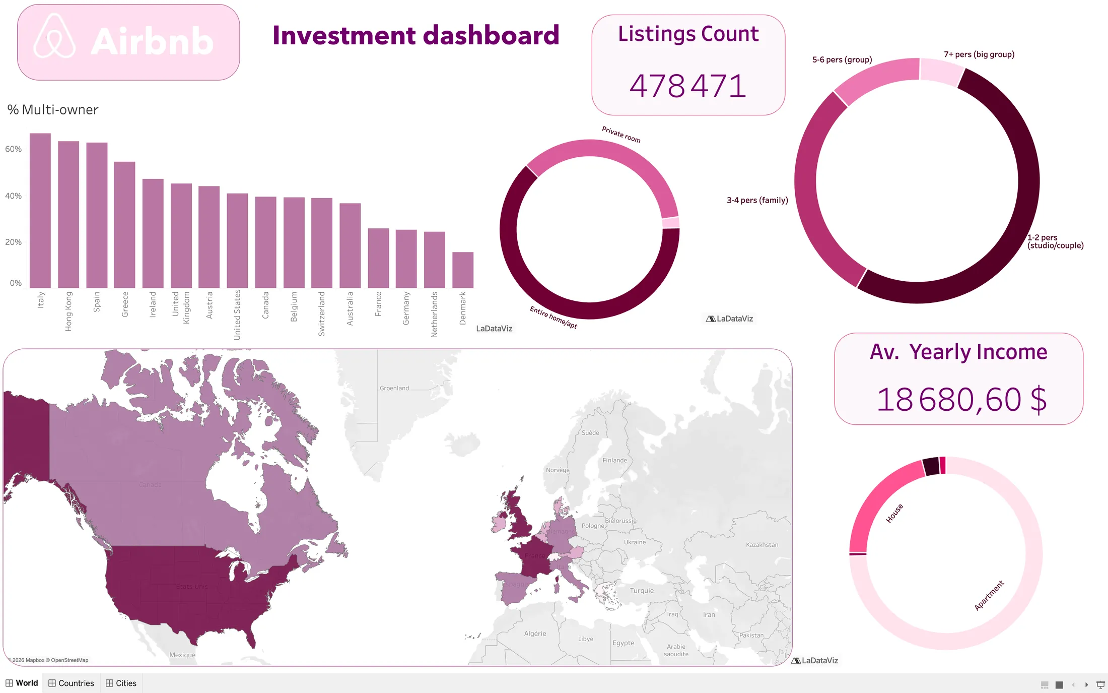
Every visual filters the others: clicking a country on the map updates the whole page.
The first page sets the scene. Entire homes make up nearly two thirds of the supply, apartments 75% of properties, and over half of listings host only one or two guests. The United States dominate with about 130,000 listings, ahead of the United Kingdom (60,000) and France (56,000).
The most useful figure for an investor is the share of multi-owners, which ranges from about 15% in Denmark to nearly 70% in Italy. A market at 70% is no longer made of individuals earning extra income: it is a professional sector, with organised competition, but also proven profitability.
Page 2: what makes a city worth it
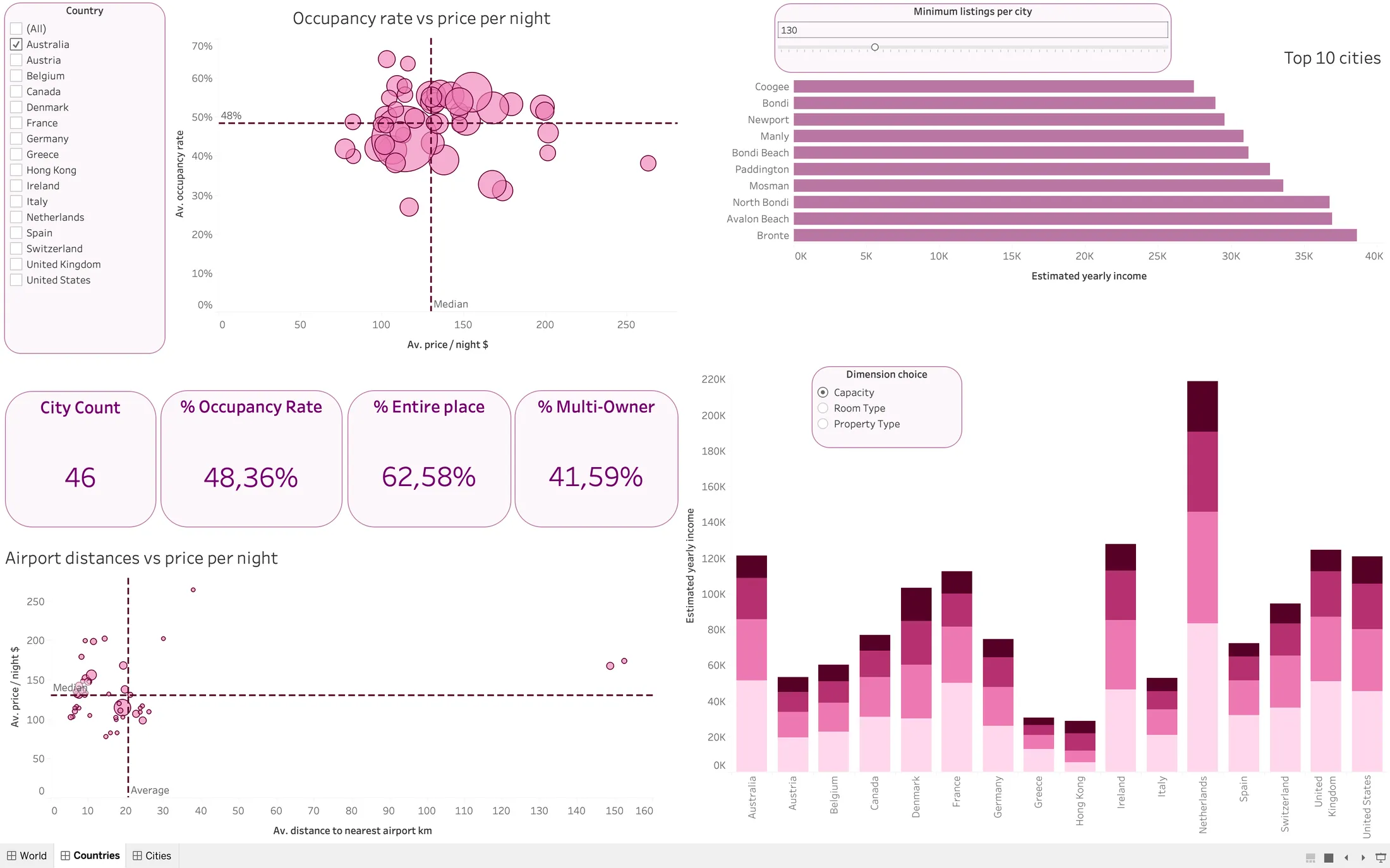
Filtered here on Australia, with the slider at 130 listings (the Sydney analysis below uses 120). Each dot is a city, sized by its number of listings; the dashed lines mark the median city price and the average occupancy.
This page tests the factors that could make a city a good investment. The first chart plots price against occupancy, split into four quadrants by the median price and the average occupancy. The expected result would be that expensive cities fill less. It does not happen: across cities, the correlation between price and occupancy is essentially zero (0.01). The top-right quadrant, where cities charge more and fill more, does exist, and that is where to look.
The second chart tests an intuition: being close to an airport should let hosts charge more. The relationship is flat. A negative result is still a result: airport distance is not a selection criterion, and it is better to rule a factor out with evidence than never to test it.
The slider is the safeguard of the whole page. Without it, the most profitable cities were small villages with a handful of listings. Raising it keeps only the markets where the figure is reliable, and the ranking changes completely. Finally, a stacked bar chart switches between capacity, room type and property type with a single parameter: three readings of the same question without three charts.
Page 3: choosing between cities
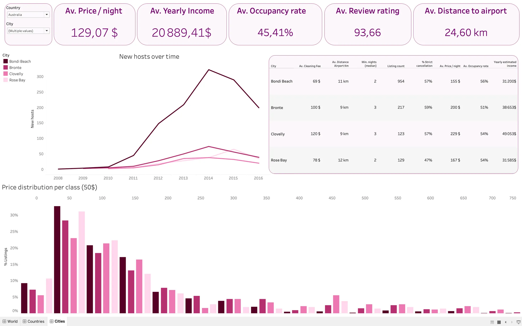
Up to five cities can be compared at once. The KPI cards stay at national level, as a reference.
The last page zooms in on a few cities: the arrival of new hosts each year (a sign of maturity or saturation), the price distribution in $50 bands, shown as a percentage so that a large city does not crush a small one, and a table of the hidden frictions: cleaning fees, minimum stays and strict cancellation policies.
Running the method: Sydney
To show the method end to end, I applied it to a market I know well. In Australia, keeping only cities with at least 120 active listings, all ten of the most profitable places are suburbs of Sydney, and six of them are in the Eastern Suburbs: Clovelly, Bronte, North Bondi, Paddington, Rose Bay and Bondi Beach. It is not a city that stands out, it is a coastal corridor a few kilometres long. Having lived there, the data matches what I saw: beaches within walking distance of one another, the city centre eight kilometres away, the airport about ten, and demand that holds up all year round.
| Suburb | Listings | Price / night | Occupancy | Est. yearly income |
|---|---|---|---|---|
| Bondi Beach | 954 | $155 | 56% | $31,200 |
| Bronte | 217 | $200 | 51% | $38,653 |
| Rose Bay | 129 | $167 | 54% | $31,585 |
| Clovelly | 123 | $229 | 54% | $49,053 |
Clovelly has eight times fewer listings than Bondi Beach, but charges $229 a night instead of $155 for almost the same occupancy. The result is an estimated $49,000 a year instead of $31,000, nearly 60% more per property. It confirms, at neighbourhood level, what the page 2 scatter plot showed: charging more does not mechanically lower occupancy.
Limits I want to be upfront about
- Occupancy is a proxy. It comes from calendar availability, not real bookings: a host who blocks dates without renting is counted as if they had rented. The estimated income is therefore an upper bound, useful to compare cities with each other, not to forecast revenue.
- Seasonality is smoothed out. Two cities with the same yearly income can have very different seasons. Inside Airbnb’s calendar file, with day-by-day prices, would be the natural next step.
- The data stops in 2017. Several of these cities have tightened their short-term rental rules since. The dashboard describes a state of the market, not a forecast.
What I learned
[In your own voice, two or three sentences: for example, what designing a dashboard around an investor’s reasoning taught you, why you made the slider adjustable rather than fixing a threshold, or what switching from Power BI to Tableau showed you.]