
The question
La poule qui chante is a French poultry producer that wants to grow abroad. Its CEO asked for a clear answer to a broad question: which countries offer the best export opportunities? The study had to cover at least 100 countries and 60% of the world’s population, build on two datasets from the FAO, and gather at least eight indicators through the PESTEL framework (political, economic, social, technological, environmental and legal factors).
With 164 countries and 15 indicators, nobody can compare every country on every variable by eye. The approach was to let the data reveal its own structure: reduce the 15 indicators to a few meaningful dimensions with a principal component analysis, then group similar countries with a clustering, and only then decide where to go.
- 164countries analysed
- 95%of the world population covered
- 15indicators across the 6 PESTEL dimensions
- 4country profiles, one clear target
Building the dataset
I combined three public sources: the FAO (poultry production, imports and supply per person, population), the World Bank (governance indices, unemployment, internet access, tourism, logistics performance, income group) and a dataset of distances between capital cities, to measure how far each market is from Paris. The files were merged in Excel through correspondence tables on ISO3 and FAO country codes, so that each country appears exactly once.
| PESTEL dimension | Indicators |
|---|---|
| Political | Political stability, control of corruption |
| Economic | Poultry production, poultry imports, poultry supply per person, unemployment |
| Social | Population, population growth, tourist arrivals, tourism growth |
| Technological | Internet access, Logistics Performance Index |
| Environmental | Distance from Paris |
| Legal | Rule of law, regulatory quality |
Missing data, handled country by country
Only 105 of the 181 countries had a complete profile. I set a strict rule: a country could miss at most two indicators out of fifteen. Beyond that, its profile would rest more on estimates than on data, so 17 countries were excluded, together representing less than 5% of the world population.
For the remaining gaps, the imputation depended on what the gap meant. Values of zero for internet access or unemployment were treated as missing rather than real, then filled with the median of the country’s income group: a low-income country is compared with other low-income countries, not with the global average. Missing tourism figures, on the other hand, were set to zero, since they mostly concerned unstable or very small states where tourism is genuinely negligible.
   # Fill gaps with the median of countries in the same income group (IC)
   for col in ["Internet", "Chomage"]:
       df_volaille[col] = df_volaille.groupby("IC")[col].transform(
           lambda x: x.fillna(x.median())
       )
Taming the giants
Population, tourism, poultry production and imports were heavily skewed: China and India alone stretch every scale. Rather than removing these countries, which are real markets, I applied a log transformation to these four variables. It brings their distributions close to symmetrical and stops a handful of giants from dominating the analysis. Tested both ways, it let the principal component analysis capture three extra points of variance. All 15 variables were then standardised, so that each one weighs the same whatever its unit.
Reducing 15 indicators to 5 dimensions
The correlation matrix showed three families of variables: governance, logistics and internet access move together; population, production and imports move together; unemployment, tourism growth and distance stand on their own. That redundancy is exactly what a principal component analysis (PCA) exploits.
- F140.8%
- F215.1%
- F38.8%
- F47.5%
- F56.9%
- F64.8%
- F74.2%
Five components have an eigenvalue above 1 (Kaiser criterion) and together keep 79.1% of the original information.
Three methods agreed on keeping five components: the Kaiser criterion, the elbow of the scree plot between F5 and F6, and a cumulative variance of 79.1%. The first two are the easiest to read:
- F1 (40.8%) measures institutional and infrastructure maturity. Governance indices, logistics performance and internet access all load strongly on it (between 0.78 and 0.94), while fast population growth pulls the other way.
- F2 (15.1%) measures demographic weight. It is driven by population (0.94) and poultry production (0.83), and separates large markets from small ones regardless of how developed they are.
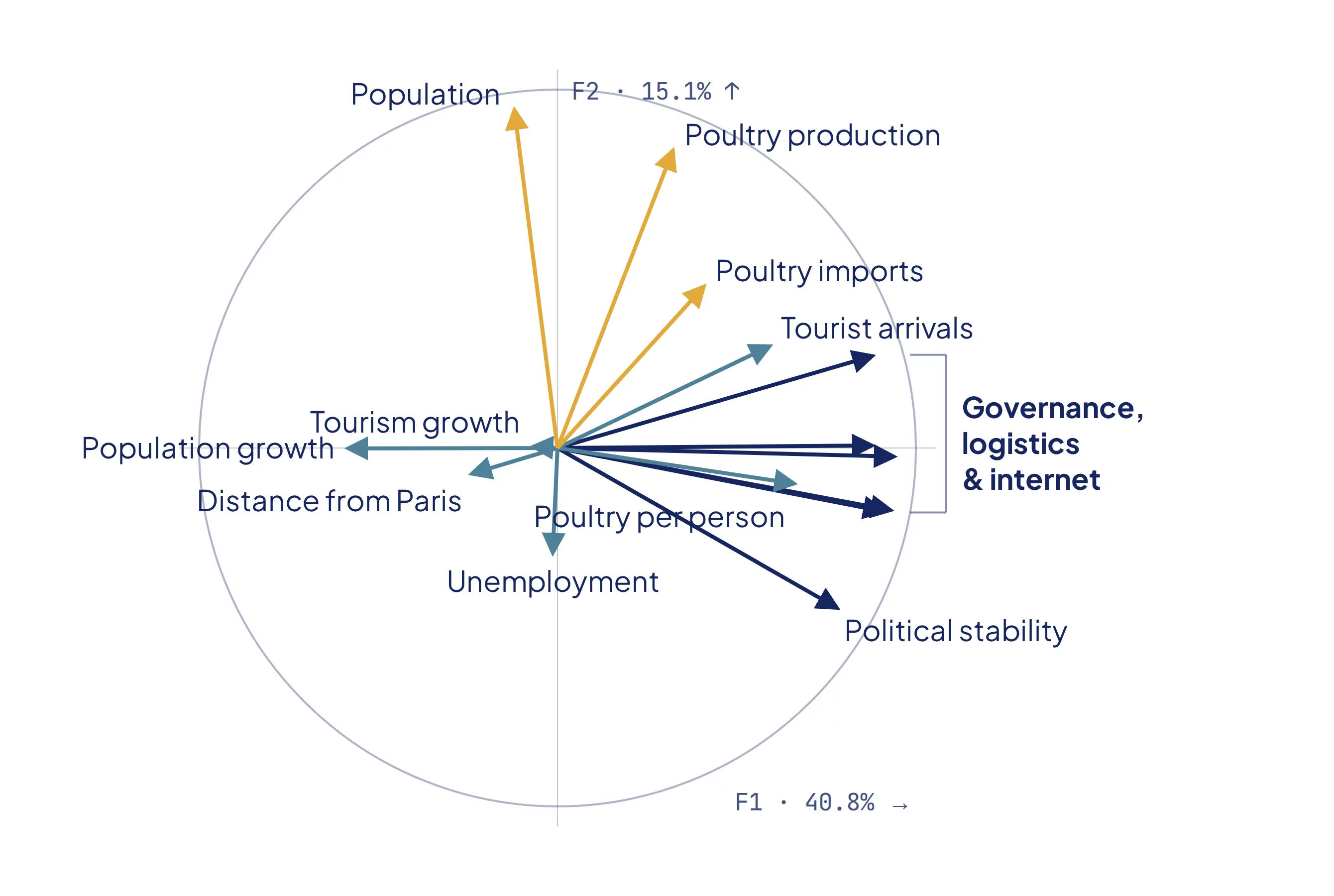
Each arrow is an indicator. The longer it is and the closer it gets to an axis, the more that axis summarises it.
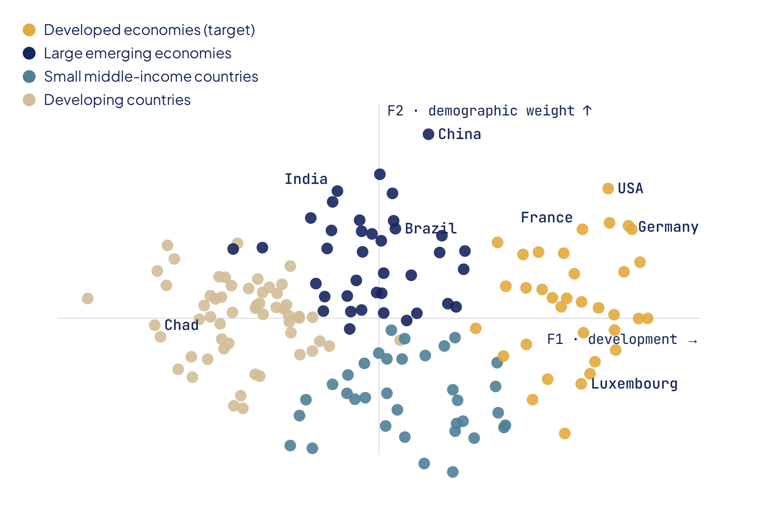
Placed on these two axes, countries fall into four natural areas: large developed economies, demographic giants still developing, small but highly developed states, and small vulnerable countries. A structure this clear called for a clustering.
Four country profiles
I clustered the countries on their five component scores. To choose the number of groups, I again crossed three methods: a hierarchical clustering with Ward’s method, whose dendrogram suggested a cut at four groups; the elbow of the within-cluster inertia, between three and four; and the silhouette score.
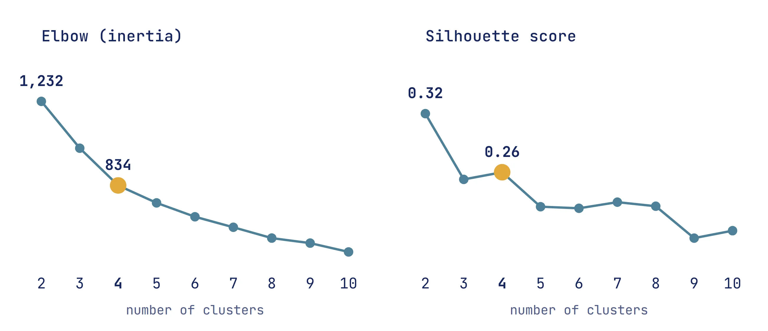
The silhouette score actually peaked at two clusters (0.32), but splitting the world into “developed” and “developing” would not support any business decision. Its second peak, at four clusters (0.26), matched the other two methods. A k-means with five clusters confirmed the choice: it left three groups untouched and simply split the fourth in two, adding no useful insight.
| Profile | Countries | Rule of law (0–100) | Poultry imports | Distance from Paris |
|---|---|---|---|---|
| Developed economies | 35 | 79.7 | 213 kt | 3,537 km |
| Large emerging economies | 38 | 49.3 | 135 kt | 6,294 km |
| Small middle-income countries | 35 | 61.4 | 18 kt | 6,567 km |
| Developing countries | 56 | 42.8 | 37 kt | 6,301 km |
The developed economies (France’s neighbours, North America, Japan, Australia…) come out on top for 12 of the 15 indicators: the strongest governance, the best logistics, the highest poultry consumption per person, the largest imports, and the shortest distance from France. On a map, they form a remarkably compact block across Europe.
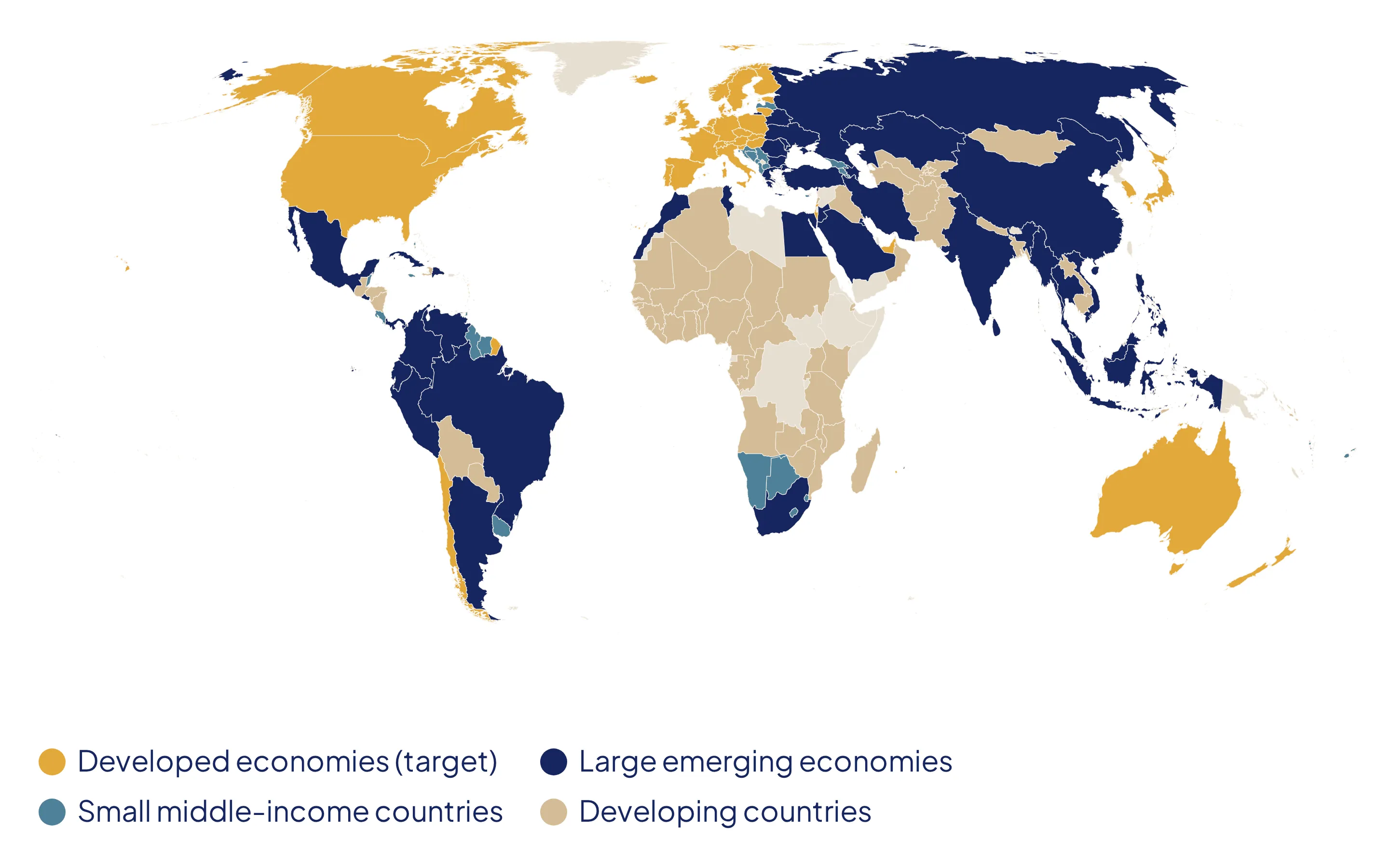
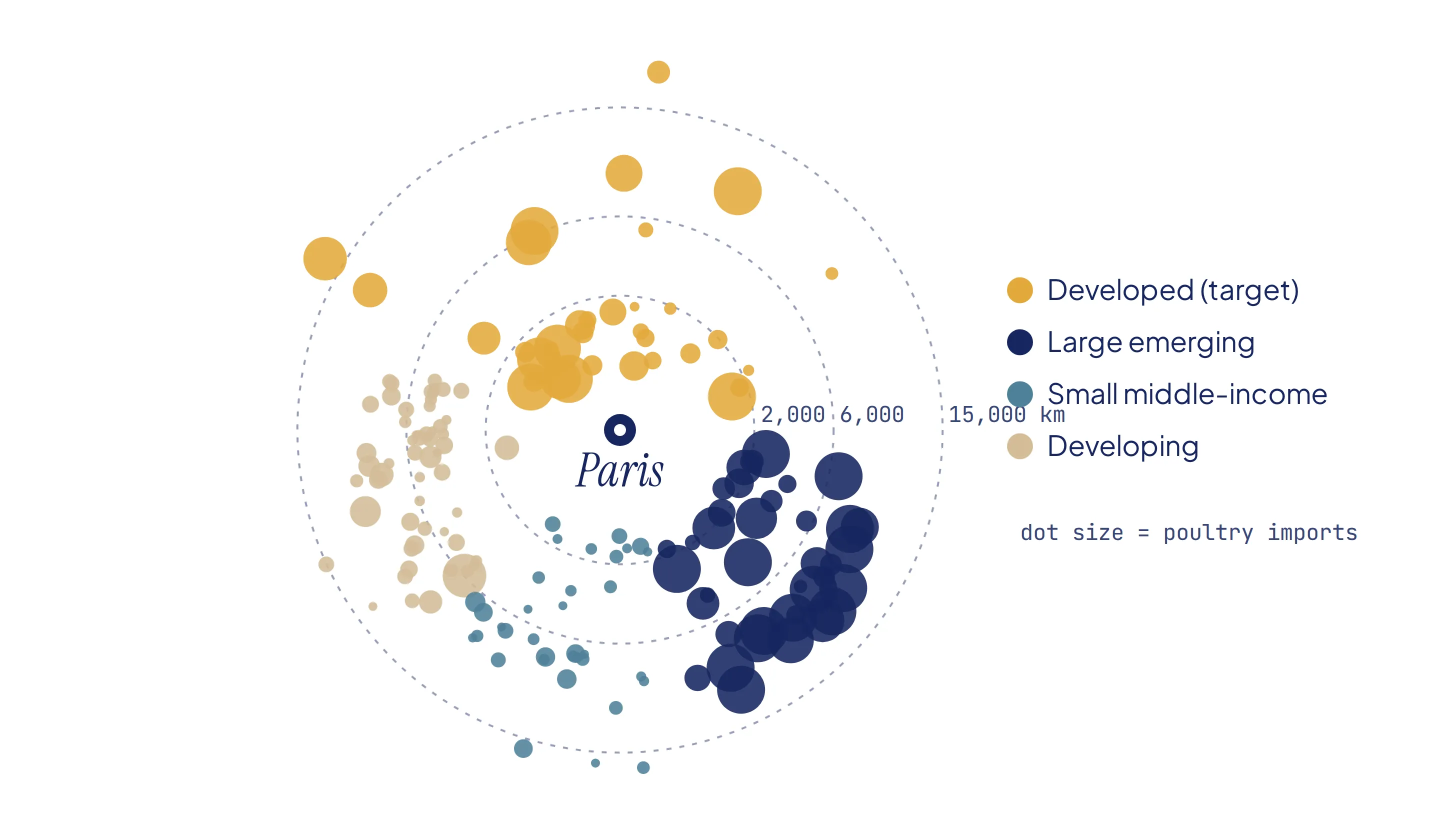
Distance from Paris to each capital; the size of each dot reflects poultry imports. The large target importers sit within a few thousand kilometres.
A three-stage export roadmap
- Short term: Europe. Germany, Belgium, Italy and Spain combine excellent governance, some of the best logistics in the world, large poultry markets and short delivery times, which matters for a fresh product.
- Medium term: the rest of the developed economies. The United States, Canada, Japan, Australia and New Zealand offer strong purchasing power and premium demand, but their distance makes transport and the cold chain far more expensive.
- Long term: the large emerging economies. China and India are enormous poultry markets, but their governance indicators do not yet secure trade at this stage. They are markets to monitor, and to enter once their institutional stability improves.
What I would do next
- Rank countries within the target cluster. The clustering says which group to target; a weighted score built from imports, distance and logistics would say in which order to approach each country.
- Add market-specific data, such as poultry prices, import tariffs and sanitary regulations, which matter enormously for a fresh food product and are not captured by macro indicators.
What I learned
[In your own voice, two or three sentences: for example, why you chose the second silhouette peak over the first, what the PCA taught you about redundant variables, or how you turned statistics into a business recommendation.]