
The question
OpenClassrooms wanted to understand how the profile of the students enrolling in its Data Analyst path had changed over four years, to inform its thinking on accessibility and equal opportunities. The internal data had been collected, but it needed a transformation that was reliable, documented and reproducible, with strict respect for the GDPR, and enriched with public INSEE data to compare the students with the French population.
The team already worked with Snowflake and dbt, so the deliverable was a dbt pipeline, a final dataset, and a presentation for a non-technical audience.
- 4,647enrolments, 2022 to 2025
- −44%enrolments between 2022 and 2025
- 30%women, with no progress in four years
- ×2.5over-representation of Île-de-France
The pipeline
Rather than one large query, I split the transformation into layers, each with a single role. Staging cleans and standardises each raw source, one model per source. Intermediate applies business logic, such as moving from one row per enrolment to one row per student. Marts produce the final tables, ready for analysis. If a figure is wrong, I know exactly which layer to look at.
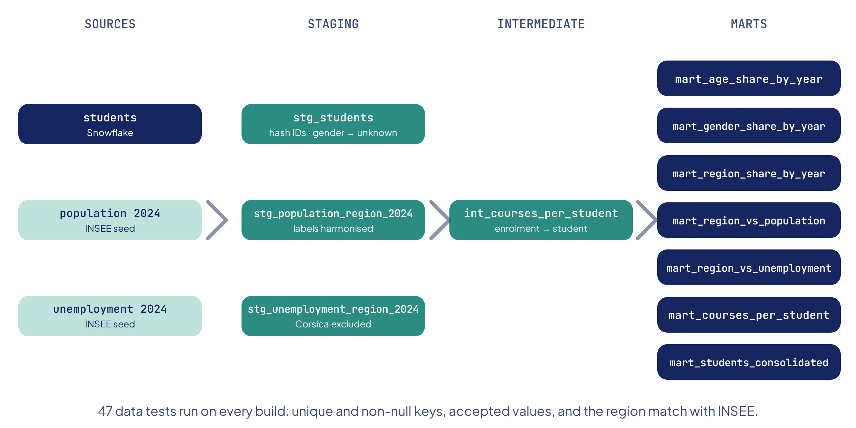
Four choices shape the whole pipeline:
| Choice | Why |
|---|---|
| Identifiers hashed with SHA-256 in staging | GDPR: no raw identifier goes further than the first layer. It is pseudonymisation, not anonymisation, since the link can in theory be rebuilt at the source, and I state it as such |
| Missing genders kept as “unknown” rather than deleted | Deleting them would hide the non-response rate, which turned out to be one of the key findings |
| Region labels harmonised with INSEE, overseas departments grouped as DROM, Corsica excluded | Without identical labels, a join silently loses rows |
| Tests on every run | Unique and non-null keys, accepted values for each variable, and a relationship test checking that every student region exists in the INSEE reference |
That last test is the one that served me most: it catches any label mismatch between the student data and INSEE before it can distort a result.
-- stg_students: pseudonymise identifiers and make missing genders explicit
select
    {{ hash_id("replace(user_id, '-', '')") }} as user_id_hash,
    {{ hash_id("replace(user_id, '-', '') || '_' || year_path_started") }} as primary_key,
    path_category_name as category,
    age_group,
    coalesce(gender, 'unknown') as gender,
    region,
    year_path_started as year_started
from {{ source('openclassrooms', 'students') }}
Enrolments are falling
- 20221,696
- 20231,150
- 2024850
- 2025951
The completeness of 2025 remains to be confirmed with the data collection team.
Enrolments fell from 1,696 in 2022 to 850 in 2024, then partly recovered to 951 in 2025: a net drop of 44%. The data does not explain why: there is nothing on the job market or on marketing. It is an observation, not a diagnosis. But if the data cannot say why fewer students enrol, it does show who still does, and that profile is changing.
A younger audience
Students under 35 went from 43% of enrolments in 2022 to 53% in 2025, and became the majority. All of that growth comes from the youngest: the 20–24 share was multiplied by seven, from 1.2% to 8.5%, and the 25–29 share rose from 15% to 21%. Every older age group declined.
A path that stays male, and a trap in the raw data
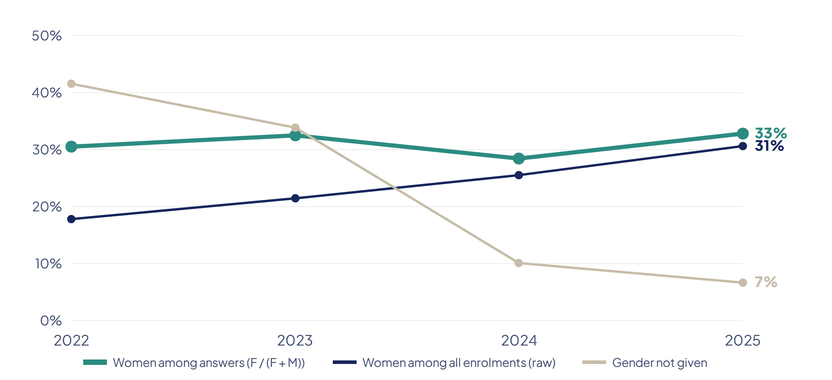
In the raw data, the share of women seems to climb from 18% to 31%. It is an artefact. In 2022, more than four enrolments in ten had no gender; in 2025, fewer than one in fifteen. What is really improving is data collection, not gender balance. Measured only among students who gave their gender, which is the reliable indicator, the share of women stays around 30% every year. The decline in enrolments hits men and women alike.
- 20–2418%
- 25–2928%
- 30–3433%
- 35–3933%
- 40–4437%
- 45–4933%
- 50–5430%
- 55–5931%
- 60+7%
This is the key insight of the analysis. The core of the age range is stable, between 30% and 37% women, but the youngest group drops to 18%. And the youngest groups are precisely the ones that are growing. As the audience gets younger, the overall share of women will mechanically fall, unless something is done.
No region comes close to parity either, with rates between 21% and 36%. Île-de-France, at 36%, pulls the national average up; elsewhere it is around 27%. Regional gaps rest on small numbers and are not interpretable one by one: gender balance is a national issue for the field, not a territorial one.
A strong concentration in Île-de-France
- Île-de-France2.49
- Provence-Alpes-Côte d’Azur0.83
- Auvergne-Rhône-Alpes0.78
- Hauts-de-France0.74
- Nouvelle-Aquitaine0.70
- Centre-Val de Loire0.69
- Occitanie0.68
- Grand Est0.68
- Bretagne0.59
- Pays de la Loire0.59
- Normandie0.50
- Bourgogne-Franche-Comté0.41
- Overseas regions (DROM)0.30
Shares computed on all enrolments from 2022 to 2025. A ratio of 1 means a region weighs as much among students as in the population.
Île-de-France accounts for 46% of students but only 18% of the French population, an over-representation by a factor of 2.5. Twelve regions out of thirteen sit below their demographic weight. For a course that is 100% online, this is striking: there is no geographic barrier to remove, so the issue is not access but visibility outside the Paris region.
I tested an obvious explanation: regions with high unemployment might send more people into retraining. It does not hold. Hauts-de-France has the highest unemployment but an average presence, Île-de-France an average unemployment rate but a record presence. A regional average says nothing about the individual situation of the people who enrol.
A one-off audience
86% of students follow a single path (3,442 out of 4,010); only 14% come back for another one. With enrolments falling, the business relies almost entirely on finding new students. Recent cohorts have had less time to come back, so this rate is a floor, but it is unlikely to change much on its own.
Recommendations
- Target young women in recruitment, the group where the gap is largest and the audience is growing.
- Build visibility outside Île-de-France, since online training has no geographic barrier.
- Collect professional status at enrolment, to understand who signs up and why.
- Keep improving gender collection, already much better since 2022.
- Repeat the study in two to three years, on a now homogeneous base, by re-running the same pipeline.
Limits
- The causes of the decline are not in the data: the analysis describes, it does not explain.
- The completeness of 2025 remains to be confirmed.
- Regional gaps rest on small numbers for several regions.
- The overseas regions are left out of the unemployment comparison: they are grouped into a single DROM category, and no single unemployment rate can fairly represent five regions as different as Martinique and Mayotte, so I chose to leave the group out.
- One INSEE year (2024) is used for the whole period; regional population shares move by less than 0.15 point between 2022 and 2025.
What I learned
[In your own voice, two or three sentences: for example, what splitting a pipeline into layers changed, why you kept the missing genders, or what the region relationship test caught.]