
The question
Sanitoral is an international oral care company. Its Project Management Office was running 104 IT and marketing projects in 52 countries, with no shared way to see which ones were drifting. Each project was tracked on three indicators: cost, time and deliverables. The rule was simple: a gap of 15% or more between plan and reality on any of them should alert the directors.
Three levels of directors needed to read the same data differently. The CEO decides whether a project continues or stops, and needs the whole portfolio. Regional directors step in with the country directors of their zone. Country directors take the corrective action on their own projects.
So the question was: which projects are drifting, on what, and where?
- 104projects in 52 countries and 4 regions, 2018 to 2022
- 7.3%overall cost overrun, under the 15% alert
- €4.1Mspent beyond plan behind that 7.3%
- 89.5%of planned deliverables actually delivered
Six tables, one key
The data came as an Excel workbook: one sheet for the plan, three sheets for what actually happened, and three reference sheets.
| Table | Content | Rows |
|---|---|---|
| Projects_plans | Planned cost, duration and deliverables for each phase, with its start date | 520 |
| Actual_Costs, Actual_Duration, Actual_Delivrable | What each phase really cost, lasted and delivered | 520 each |
| Project type | IT (CRM implementation) or Marketing (product launch) | 104 |
| Projects_Locations, Country_Profiles | Country of each project, then region of each country | 104 and 52 |
Marketing projects have four phases, numbered 1 to 4, and IT projects six, named A to F. A plan row and its actual row only match on a project and a phase, so in Power Query I built a Project ID - Phase key in all four tables. That key carries the one-to-one relationships between the plan and the three actual tables; the project ID links the plan to its type and country, and the country to its region.
The dashboard
I built a multi-page Power BI report: a home page that presents the portfolio and links to each page, one page per indicator (costs, delays, deliverables), and a world map, followed by the user stories and the data model for reference.
Like the whole case, which comes from my OpenClassrooms training, the report is in French. In the screenshots below, Coûts means costs, Délais delays, Livrables deliverables, Prévus planned and Réels actual; a project is Critique (critical), in Attention (to watch) or Rentable (under budget).
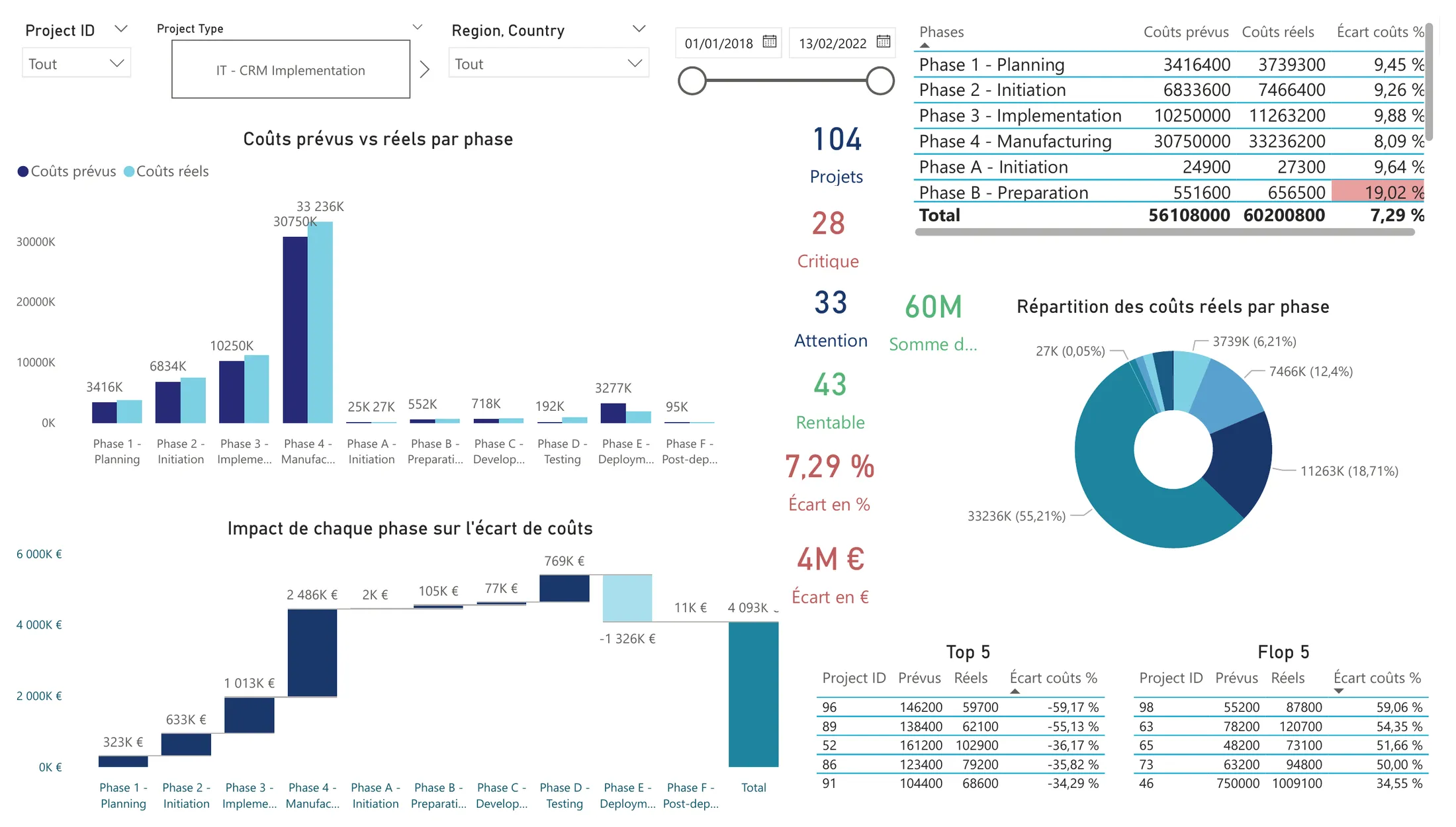
The whole portfolio, no filter: 7.29% over plan, €4M in euros. The waterfall at the bottom left shows where the gap builds up, phase by phase.
| Choice | Why |
|---|---|
| One page per indicator, the same filters on every page | Project, type, region, country and period slicers are synced: a director who filters on Egypt on the Costs page finds Egypt already selected on Delays |
| Every gap shown in % and in euros or days | The 15% rule is in percent, but the money is in euros. The costs page shows both side by side |
| Three statuses per indicator, coloured the same way everywhere | Critical (15% or more), to watch (between 0 and 15%), on target (below plan). Red, white and green in the tables, so an alert stands out before reading a number |
| Row-Level Security | A role for each of the four regional directors and for country directors: each user only sees their own scope |
| A KPI selector on the map | One map instead of three: a disconnected table lets the user switch the map between costs, delays and deliverables |
| A question-and-answer box with French and English synonyms | Directors can type “projets en retard” or “cost by country” and get a chart without touching the report |
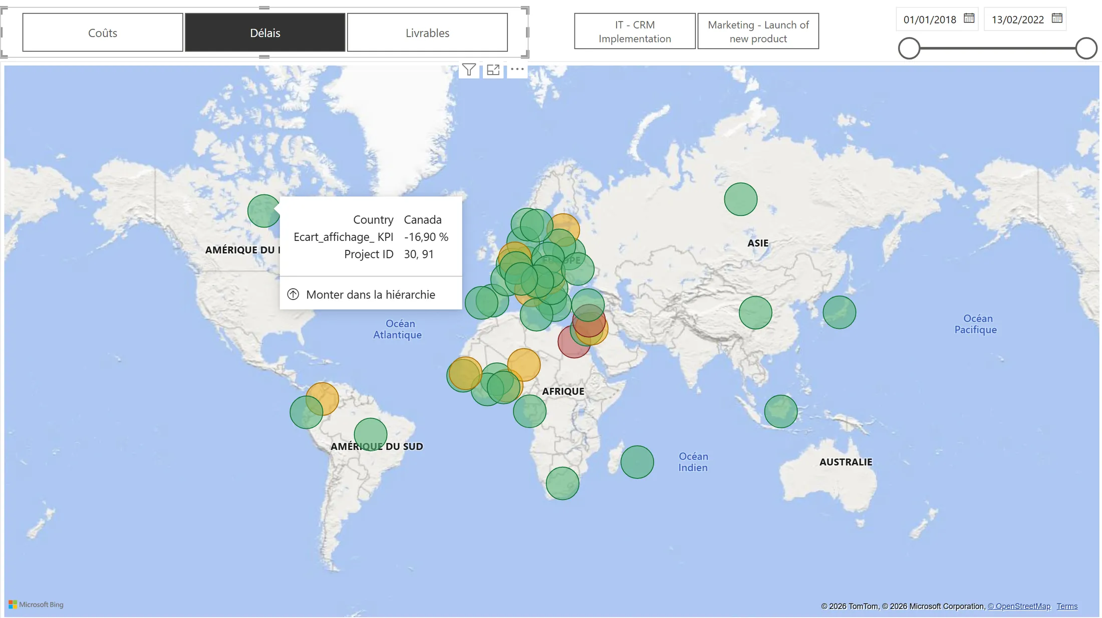
Delays selected, as the brief asked: green ahead of plan, yellow late but under the alert, red 15% or more late. Hovering a country shows its overall gap on the chosen indicator and the projects behind it: here Canada, 16.9% ahead of plan on projects 30 and 91.
Every gap is a ratio of sums, not an average of ratios. In project 14, one phase was planned for a single day and took fourteen: a gap of +1,300%. Averaged with its other phases, the project would look 303% late; summed first, it finished 26% ahead of plan, which is what happened.
ecart_couts_% =
DIVIDE(
    SUM(Actual_Costs[Actual_Cost]) - SUM(Projects_plans[Planned_Cost]),
    SUM(Projects_plans[Planned_Cost]),
    0
)

-- Number of projects 15% or more over budget, in the current filter context
couts+15% =
0 + COUNTROWS(FILTER(VALUES(Projects_plans[Project ID]), [ecart_couts_%] >= 0.15))
The 0 + makes the card show 0 rather than a blank when a filter leaves no critical project.
What the dashboard shows
Costs: a reassuring percentage
The portfolio was planned at €56.1 million and cost €60.2 million: 7.3% over, comfortably under the 15% alert. On paper, everything looked fine. In euros, it is €4.1 million nobody had budgeted.
Project by project, 28 are critical, 33 are over budget but under the alert, and 43 came in under plan. The overrun is concentrated:
| Region | Projects | Cost gap | Overrun (€M) | Critical projects |
|---|---|---|---|---|
| Central and Eastern Europe, Middle East, Africa | 56 | +9.1% | +2.46 | 18 |
| Western Europe | 33 | +5.6% | +1.37 | 6 |
| North and Latin America | 5 | +9.4% | +0.36 | 2 |
| Asia Pacific | 10 | −10.6% | −0.10 | 2 |
The first region carries 60% of the overrun and 18 of the 28 critical projects. Its size explains part of it, but not all: its gap is also above the portfolio’s. By type, marketing projects account for the entire overrun (+€4.46M), while IT projects came in €362,000 under plan. And a single phase, marketing’s Phase 4, Manufacturing, absorbs 55% of everything spent: a 1% saving there, €332,000, is worth more than a 20% saving on any IT phase except Deployment.
Delays: the best-kept indicator
Time is the indicator Sanitoral controls best: only 8 projects are 15% or more late, 16 are slightly late, and 80 finished ahead of plan. Over the whole portfolio, projects took 13% fewer days than planned.
On this page, the key visual is a dual-line chart of planned and actual duration, phase by phase. The point where the actual line crosses above the planned one shows the phase where a project starts to slip, early enough to act before the end. Project 4, in Egypt, is the clearest case: ahead of plan on Planning, it crosses over at Initiation, and from there every phase runs longer than planned, by up to 84 days on Implementation.
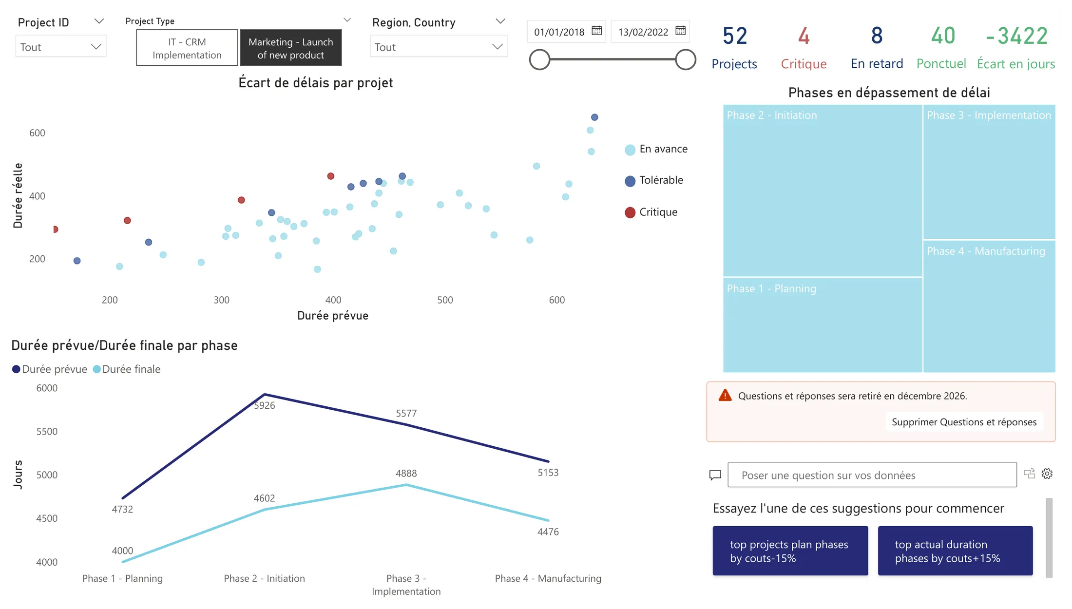
Project 4 took 294 days instead of 151. The lines cross at Initiation: from there, every phase runs longer than planned.
Deliverables: a problem spread everywhere
Only 9 projects are critical on deliverables, which sounds reassuring. But only one project delivered everything it planned: the other 94 sit just below target. Overall, 89.5% of planned deliverables were delivered, and no phase escapes it.
- Marketing 1 · Planning94%
- Marketing 2 · Initiation92%
- Marketing 3 · Implementation93%
- Marketing 4 · Manufacturing94%
- IT A · Initiation88%
- IT B · Preparation88%
- IT C · Development85%
- IT D · Testing86%
- IT E · Deployment88%
- IT F · Post-deployment88%
Every phase delivers less than planned. Either teams under-deliver everywhere, or the targets are set too high from the start.
One combination crosses the alert: IT projects in Western Europe, at −18% on deliverables.
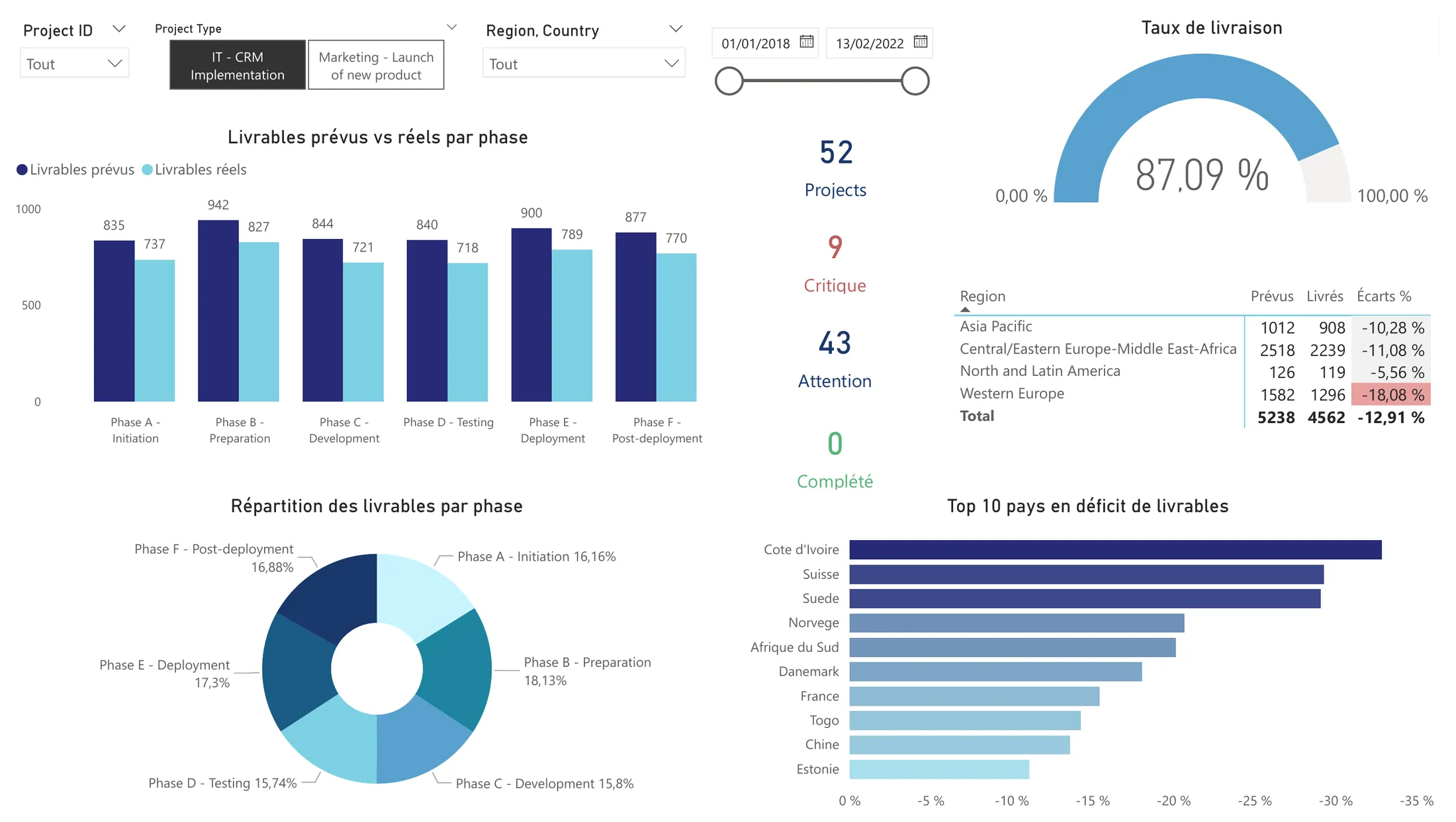
IT projects only: all 9 critical projects are IT, none delivered everything, and Western Europe is the only region past the alert.
What a second look revealed
When I came back to this project for my portfolio, I recomputed every figure from the model’s tables. They all held, but three conclusions needed a second look.
The same trap, twice. I had presented an “IT/Marketing paradox”: marketing drives the overrun, yet four of the five worst projects are IT. It is the percentage trap again. Those IT projects are the worst in percent; ranked in euros, the five largest overruns are all marketing projects, led by Switzerland at +€397,500. A marketing project was planned at €986,000 on average, an IT project at €93,000: a +59% on a small IT budget weighs less than a +26.5% on a large marketing one.
IT’s good health sits in a single phase. IT came in under budget overall, so I read it as the healthier type. Phase by phase, the picture changes.
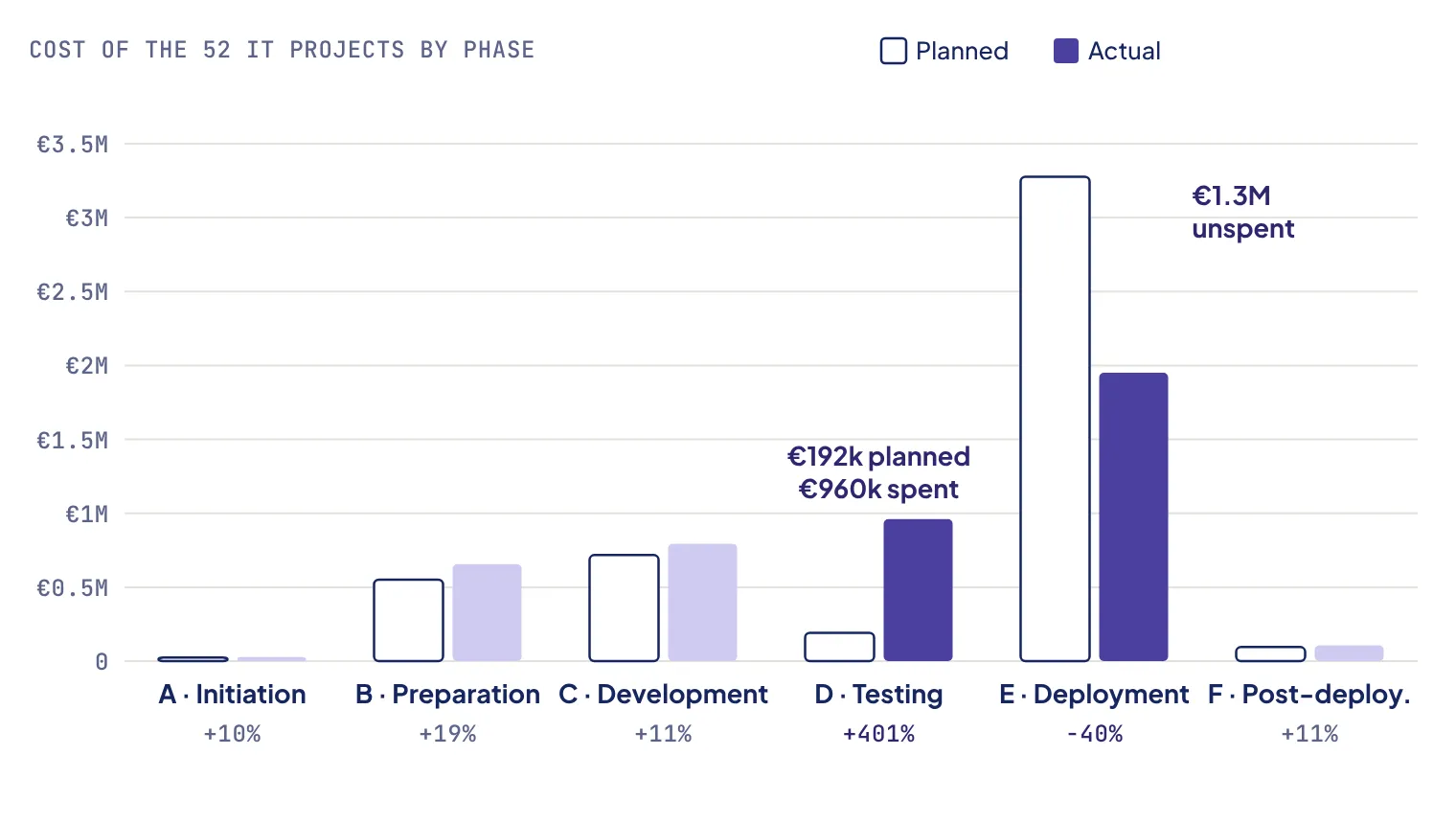
Testing overran in all 52 IT projects. Deployment came in under plan in 46 of them.
Testing cost five times its plan, and it overran in every one of the 52 IT projects. Deployment, at the same time, left €1.3 million unspent. Without Deployment, IT would be 61% over budget. The five “most profitable” projects of my original Top 5 are all IT projects whose Deployment came in €53,000 to €103,000 under plan. The data cannot say why, but the pattern looks like money planned for Deployment and spent on Testing: a planning problem more than a performance one.
Delays and costs are not linked across the portfolio. I had said that delays and costs were strongly correlated: 7 of the 8 critically late projects were also over budget. That is true, but 54 of the 96 other projects were over budget too, and over the 104 projects, the correlation between the two gaps is close to zero.
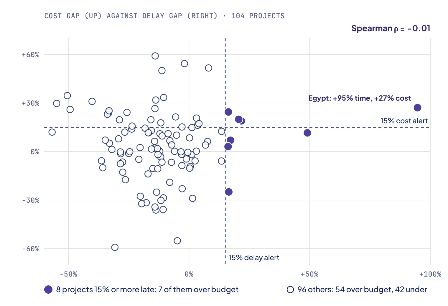
The 8 late projects are mostly over budget, but so are most of the others. Spearman's ρ = −0.01.
The same goes for my Top 5: all five finished early, but so did 80 of the 104 projects. A delay alert remains useful in its own right, but it is not an early warning for costs.
Recommendations
- Read every gap in percent and in euros. The 15% alert should run on both: €4.1 million should not pass under the radar because it is 7.3%.
- Rebalance the IT phase budgets. Plan Testing closer to what it really costs and Deployment closer to what it really spends, then watch whether the overrun disappears or just moves.
- Send the regional directors to the countries with two indicators in red: Egypt, Lebanon, Côte d’Ivoire and Switzerland.
- Question the deliverable targets. When every phase of every type lands between 85% and 94%, the target is as likely to be wrong as the teams.
Limits
- A training case: the data is a realistic extract provided by OpenClassrooms, not the books of a real company.
- The map shows an average per country, weighted by budget or duration. A country can look green while hiding one critical project, so the map is a thermometer that sends to the detail pages, not an answer.
- Every relationship filters both ways, so that all slicers update each other. On a larger model, I would keep the dimensions one-way to avoid ambiguous filter paths.
- Power BI cannot be published openly without a work account, so the dashboard is shown here through screenshots; the
.pbixfile is in the repository. - Microsoft is retiring the question-and-answer visual in December 2026, so the question box would need to move to another tool to keep working.
What I learned
[In your own voice, two or three sentences: for example, what DAX taught you about filter context, why you show every gap in percent and in euros, or what recomputing your own conclusions changed in how you present a finding.]